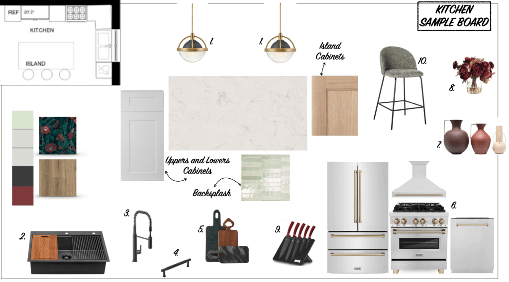
Hi everybody! I made this sample board inspired in this beautiful color scheme – may be odd for some people but this scheme is called complementary. This particular color scheme draws from two colors on the opposite side of the color wheel. When you do this, the result is a high-contrast color combo that’s bright and that pops. Examples of complementary color combinations are: Red and green; yellow and purple; orange and blue; green and magenta.
I was able to have the high contrast colors incorporated in accents through the kitchen and I think it turned out great 🙂 Let me know what you guys think.

Leave a comment